
Project background
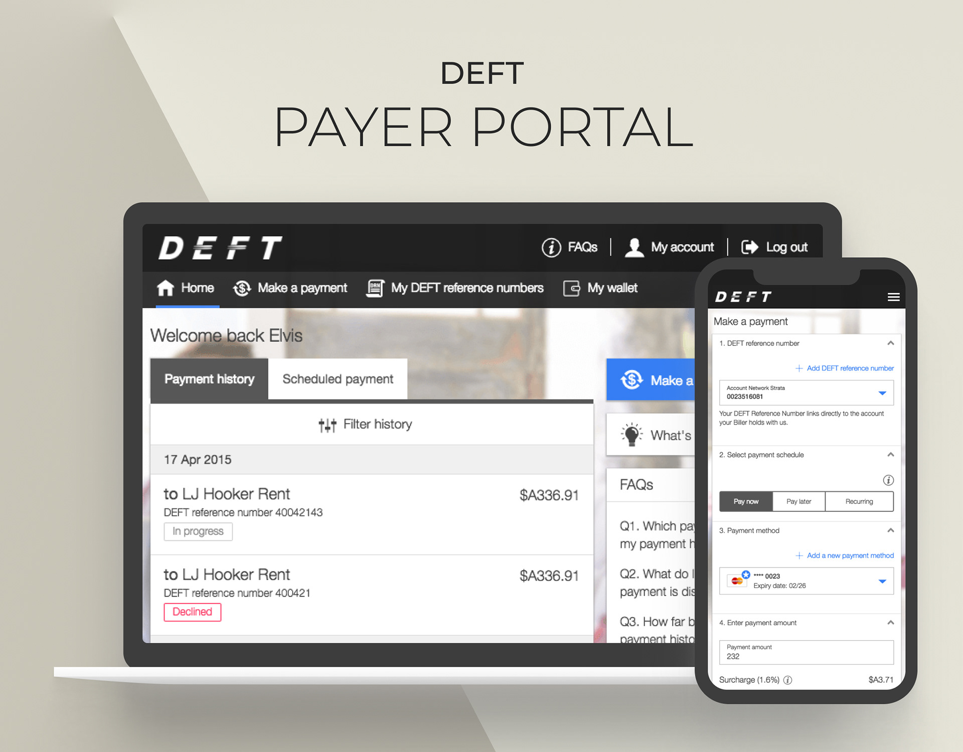
DEFT payer portal is a payment platform, providing user a way to send and manage payments.
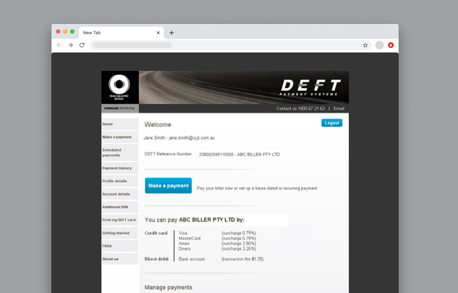
The DEFT legacy platform have been outsourced and maintained externally for the last 15 years.
The project aimed to uplift the experience and bring it in-house. I was brought on to the project to redesign the experience.
Research
My first-step into the project was to understand the existing users as well as key areas of paint points of current experience:
1. Dig into the previous research. Some researches and wireframes were buried deep in confluence from the previous project teams, which was pulled off due to budget cut
2. Speak to various stakeholders to gather knowledge about users and pain points of current portal
Main user groups
4 main user groups are using DEFT.
The primary goals for all groups are 1. Make payment and 2. Check status/details of payment.
Remote dweller will be out of scope for online portal.

Key pain points
1. Not mobile friendly. The legacy DEFT website was a desktop design. Since many users were already paying with mobile phone, having to access a desktop site on a mobile was a painful experience
2. Payment method per Biller. A payment method is stored against a bill (DEFT reference number, or DRN). If a payer wants to pay for a new bill, he/she needs to add a new card (or existing card) against the new bill, which makes it inconvenient and redundant
3. No edit on the fly. When making a payment, if a user realise his card is expired and needed to update, he/she would need to find and navigate away to Account details to make the change
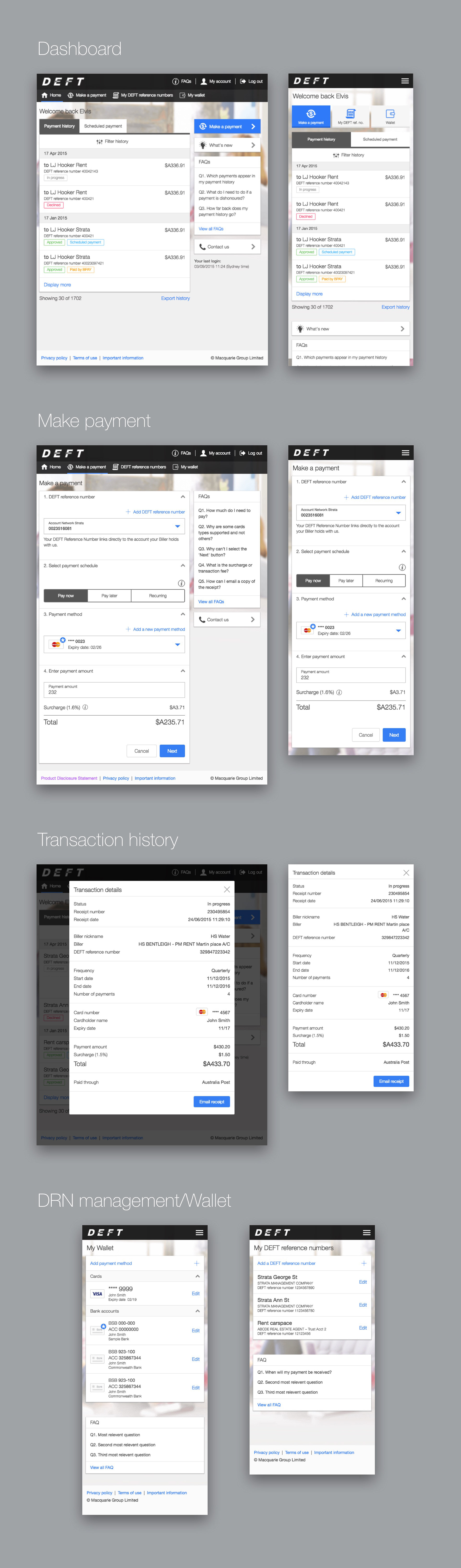
Dashboard & navigation
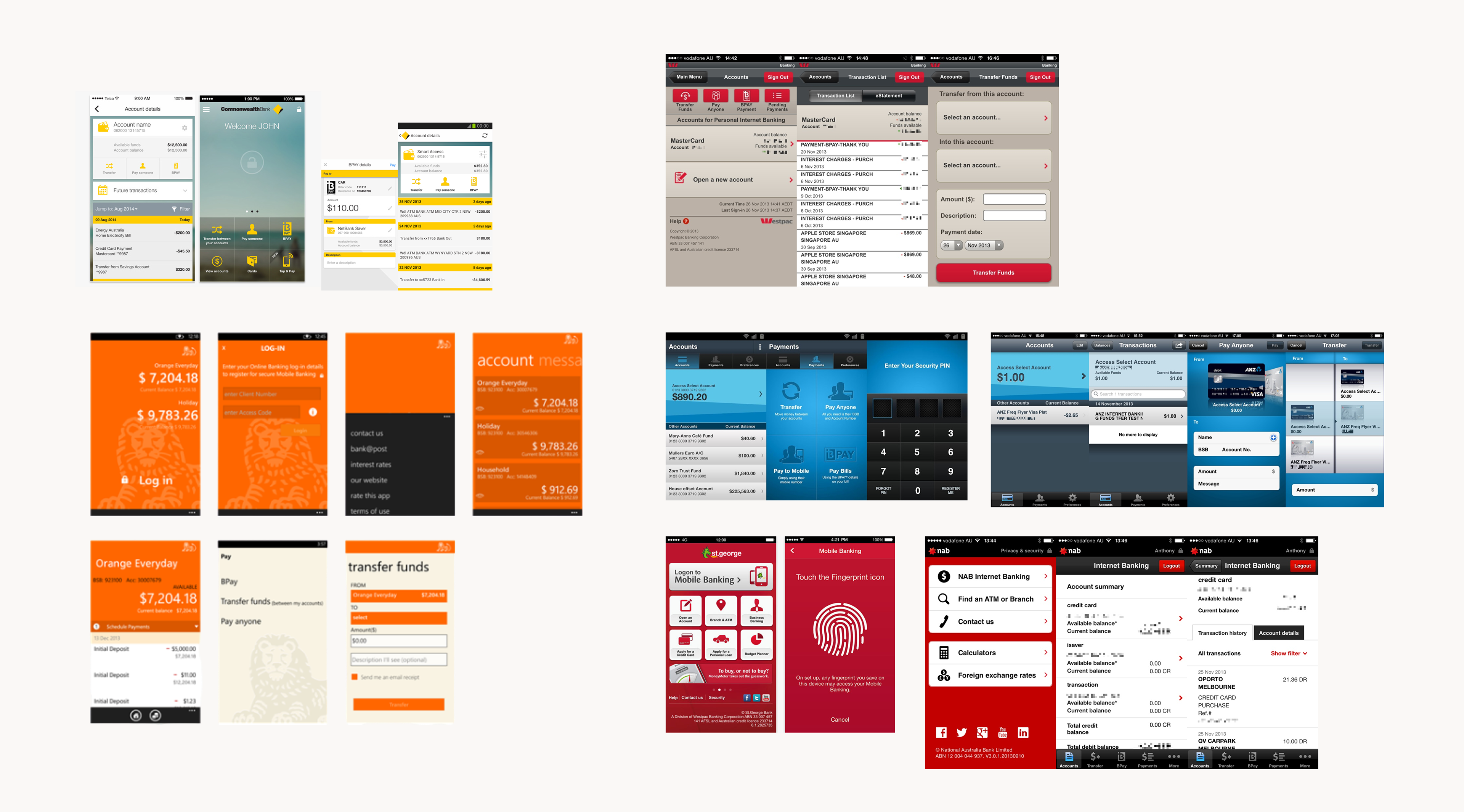
After initial research, I started looking into the navigation. I started by doing a comparative analysis across the major banking apps on the market. In summary, there were overall 2 approaches in terms of navigation. One is account driven, the other one is task driven.
We explored both options:
1. We knew our customer logs into our portal to pay, or check status of the payment
2. Functions such as wallet, My DRN(Biller number list) are supporting payment flow, user are less like to use these features a lot less frequent. Therefore they don’t need to on the dashboard
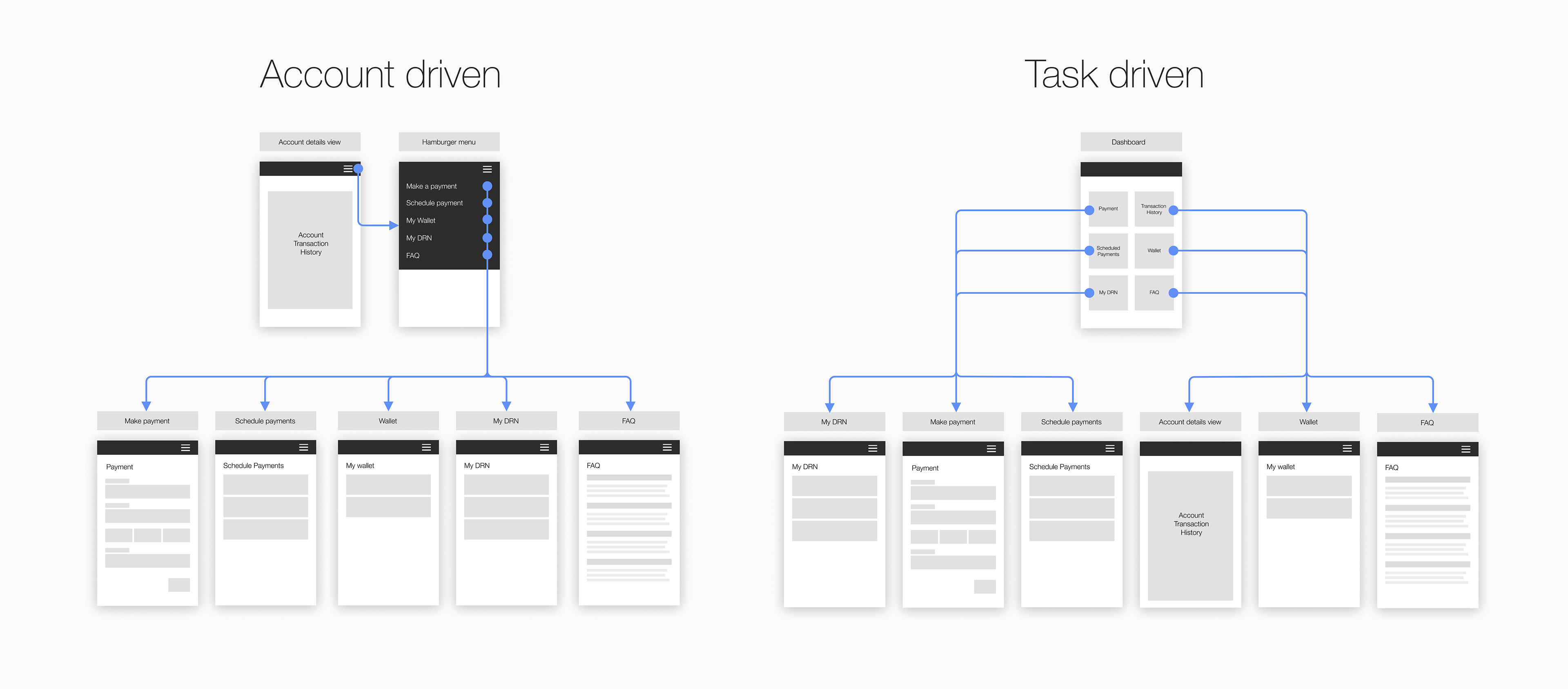
As all user’s primary actions are make + check payment, with discussion with stakeholders we decided to go for Account Driven approach without account selection screen. Instead, user sees their Transaction history straightaway on the Dashboard with make payment button.

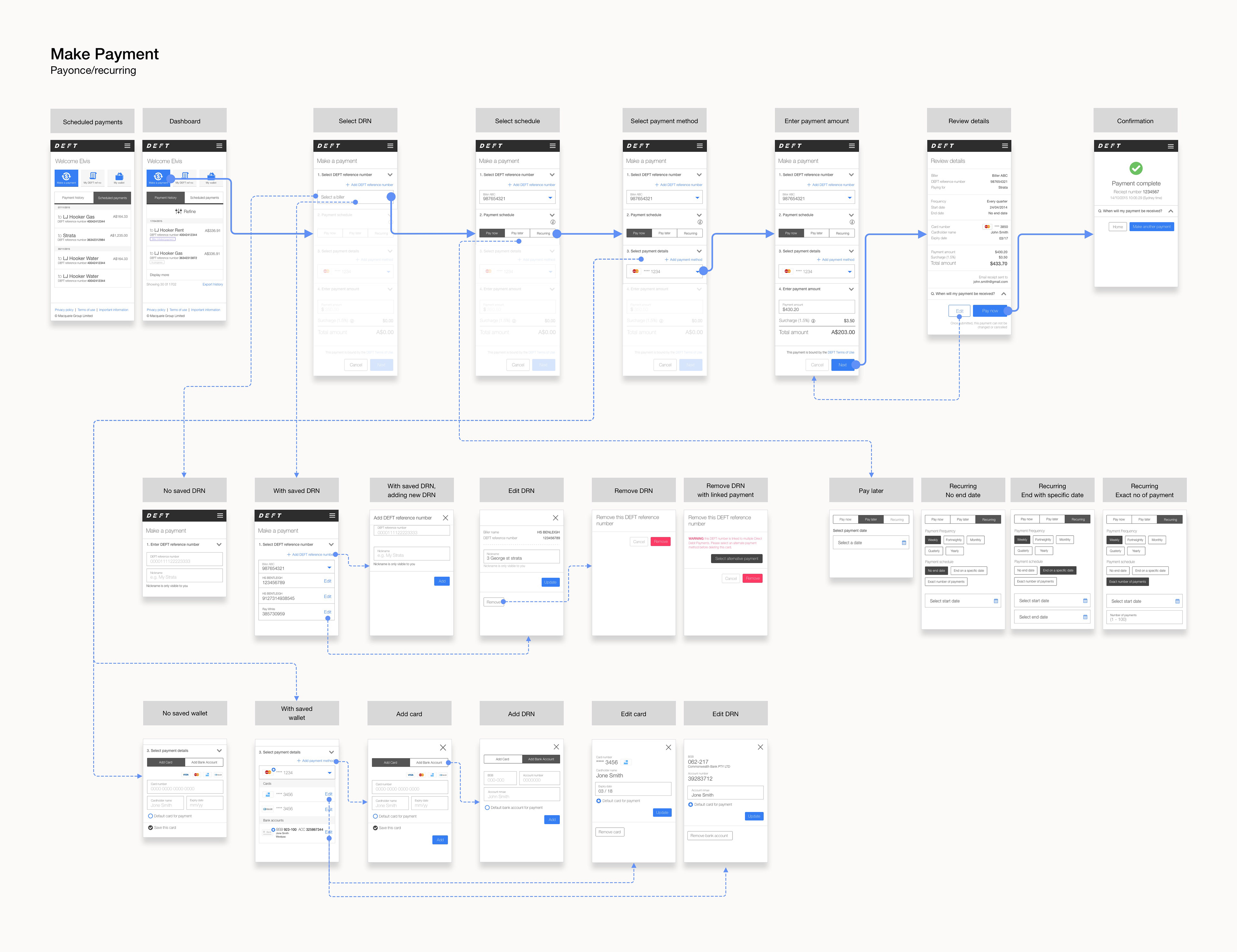
Make payment
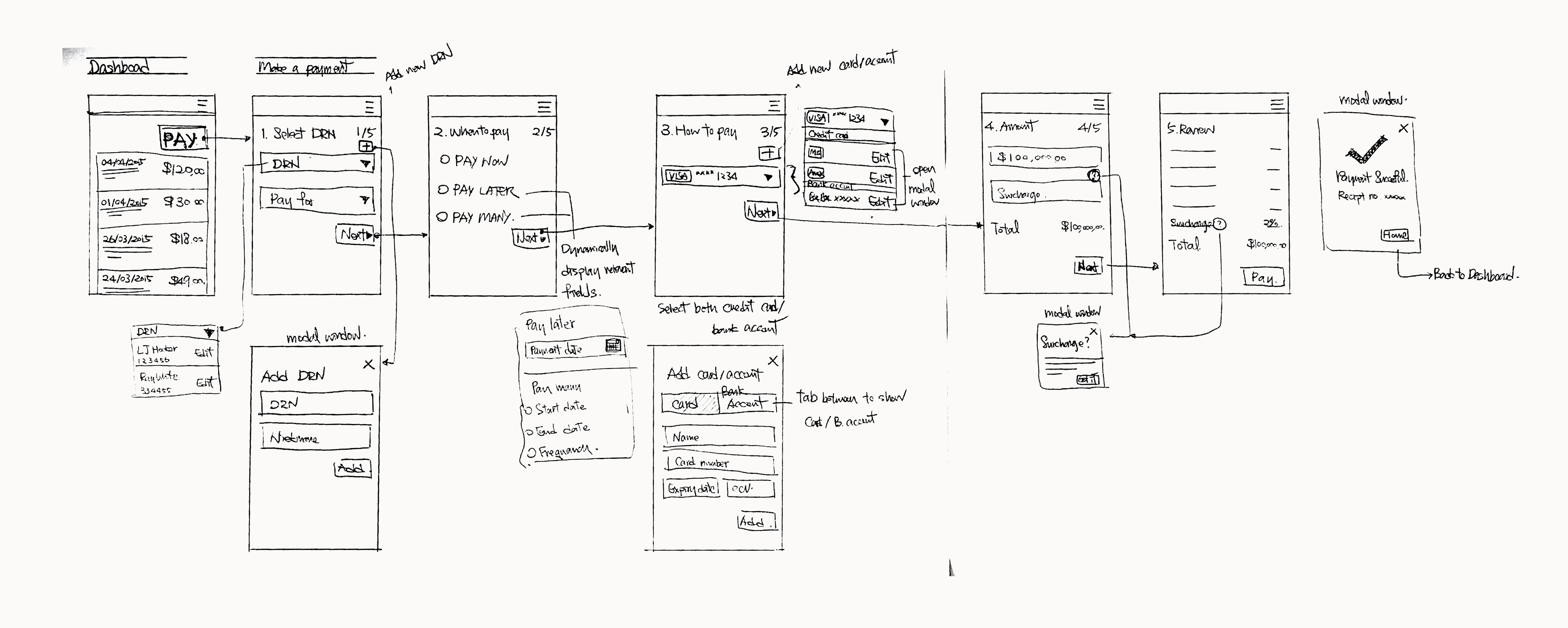
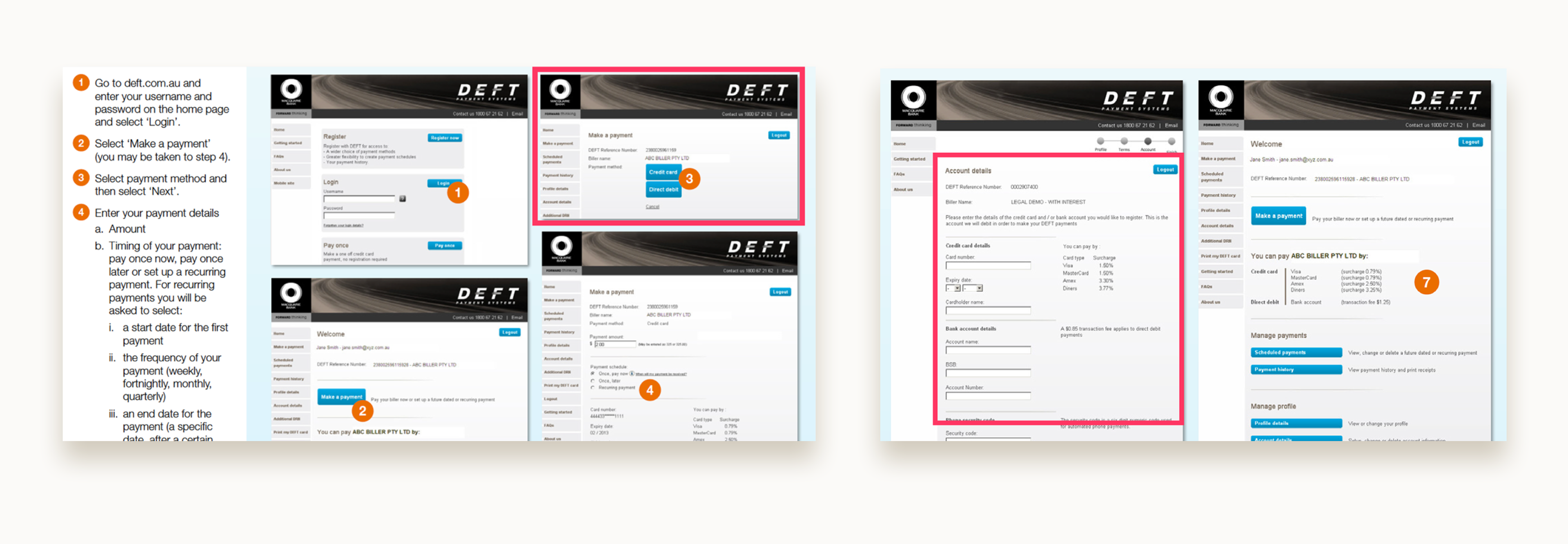
After the groundwork is set up, I started to work on the core feature of the project making a payment.
To make a payment, a user would need to enter the following details.
1. DRN (who is it paying to)
2. When ( pay now, pay later, recurring schedule payment)
3. Payment method (card or direct debit)
4. Payment amount
Since these are fair amount of details to fill, my initial approach was to break it down into a number of steps to help user focus. However our stakeholders had strong opinions on this approach, as they have receive feedbacks before that users want to have visitability of all the details in the page.
So I created both versions of prototype in Invision, we recruited 12 participants internally to test on the 2 versions
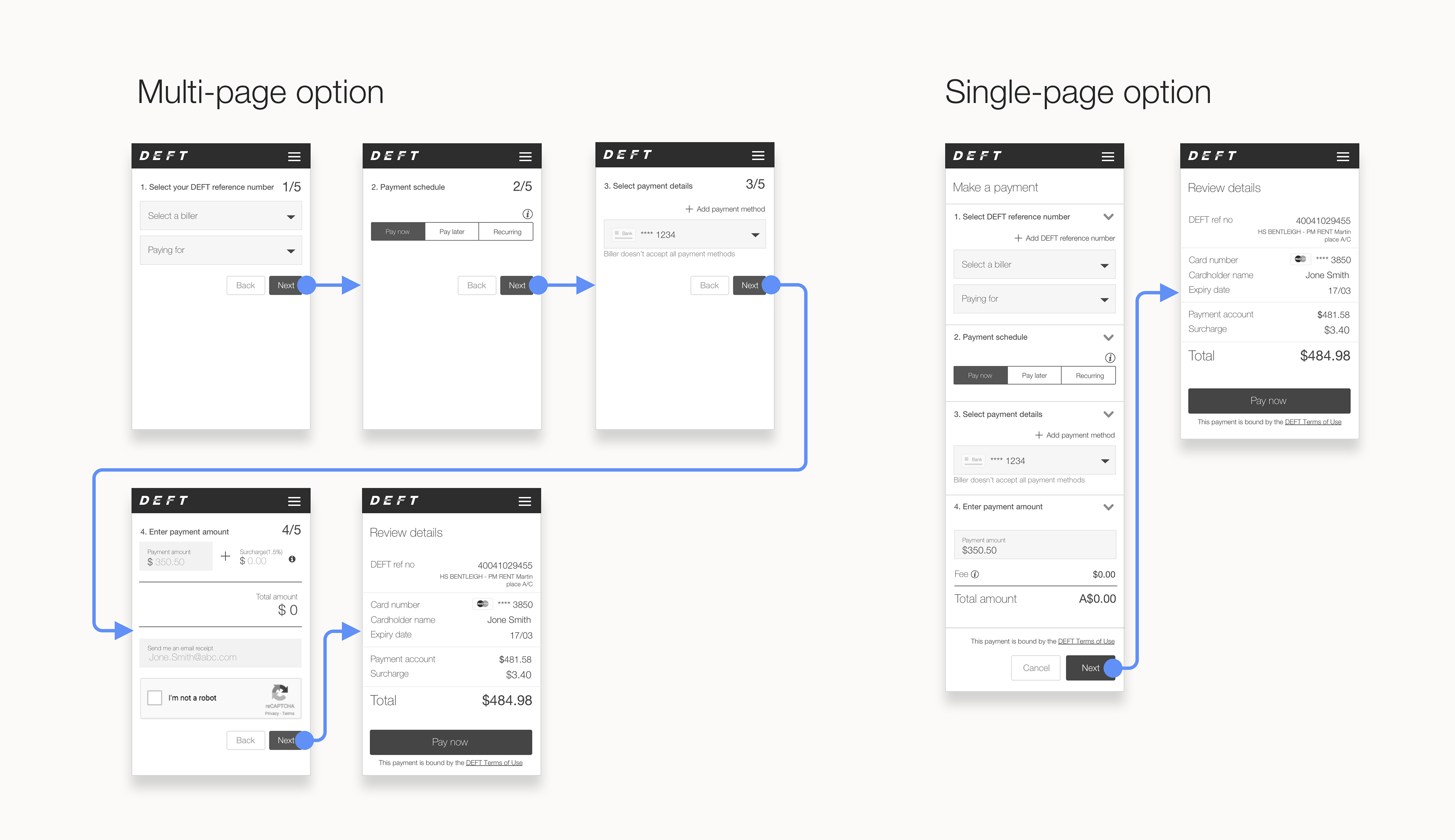
The results are as follow,
Multiple-page design:
1. No hesitation observed with more steps
2. Participants tries to review each step carefully, with information spread across different pages made this behaviour harder
3. Some participants weren’t sure if there will be a review page
Single-page design:
1. No hesitation was observed when participant needed to scroll.
2. Some participants felt it's cluttered
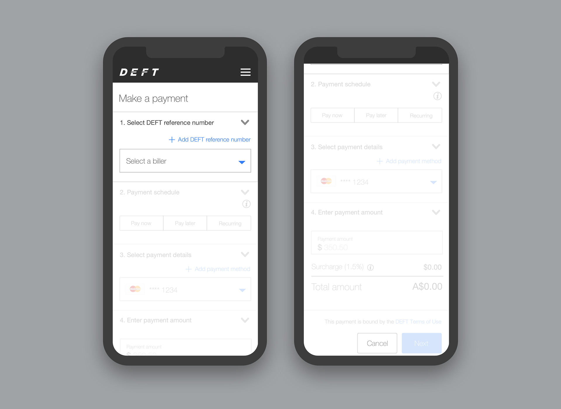
Considering the feedbacks, we decided to go with a combined solution. Based on the single page design, we disabled & faded out the 2nd and 3rd sections until the first section is completed and so on.
This way it helps user stay focused but also gives an overview during the whole payment process.
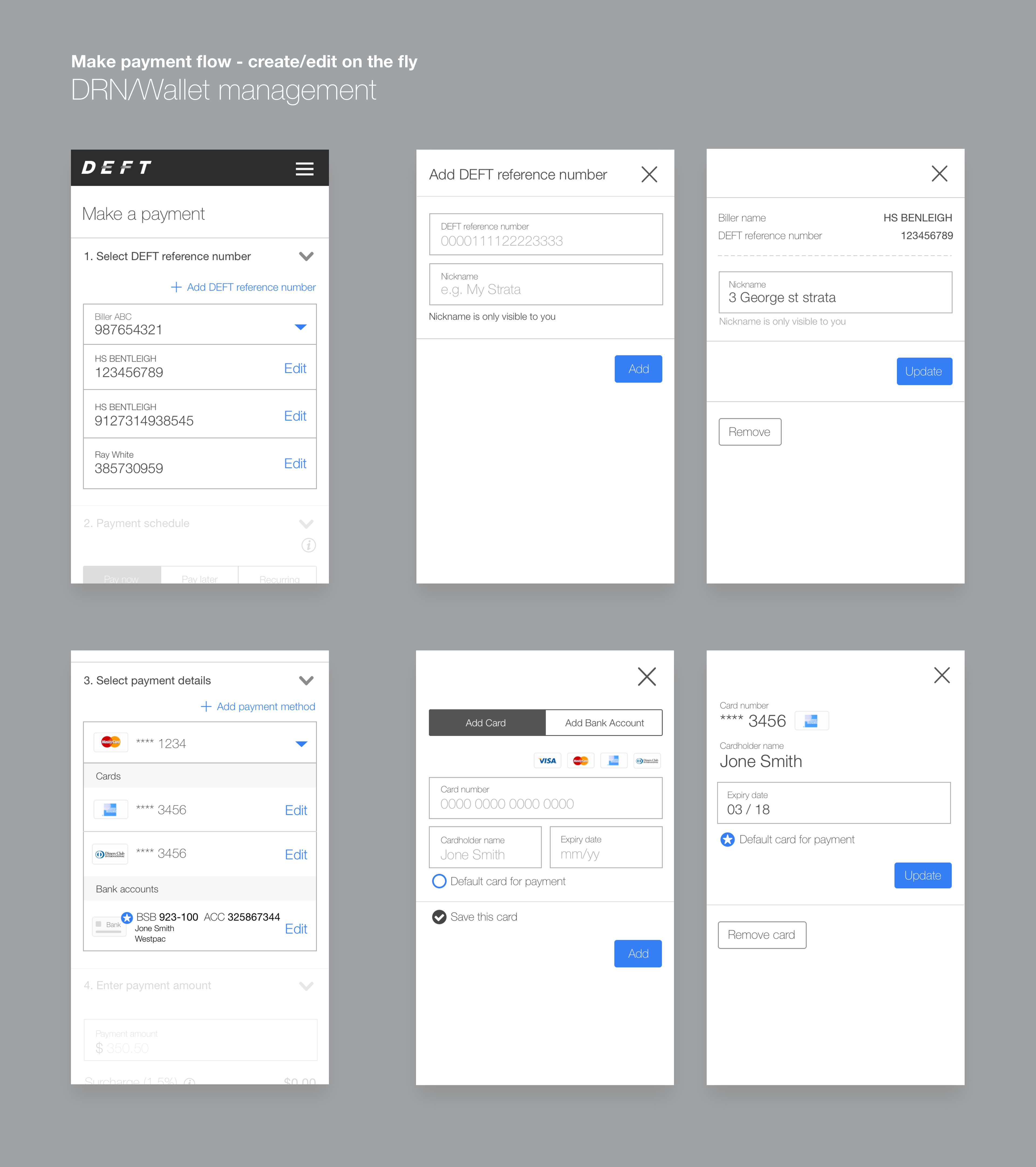
Model window for on the fly create/edit
Adding/editing additional billers/cards are opened as a modal window, to keep user in the context as well as keeping the user focused on the page by not redirecting them elsewhere.
High level payment flow
Migration
Since DEFT payment platform was maintained externally, migrating our users into our own database was a big part of the project.
The migration window was going to be 6 months. There were around 300,000 users, the migration flow needed to be as seamless as possible to minimise the impact for our customer support team.
I initially designed 3 main user flows during migration window
1. Users from legacy website (migration)
2. New user register
3. Migrated or registered user sign in
The initial iteration was to separate the 3 flows, with dedicated button for each of them, the intent was to clearly separate and instruct the user what they need to do from beginning.
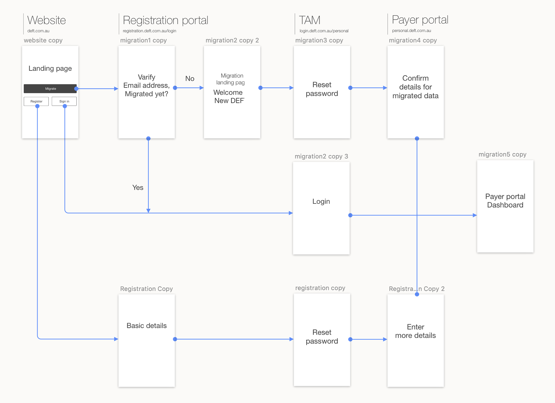
Initial migration flow
However, the result from our testing shows that, to the users they are not interested in learning about the migration.
Even though our instruction was clear, migration means nothing to them as they were merely trying to make a payment, they just want to login and get the task done.
Hence we decided to go with another approach. We removed the button for migration, merge it with "sign in" button. Instead of letting user to decide if they need to go through migration, we verify it for them.

Final migration flow
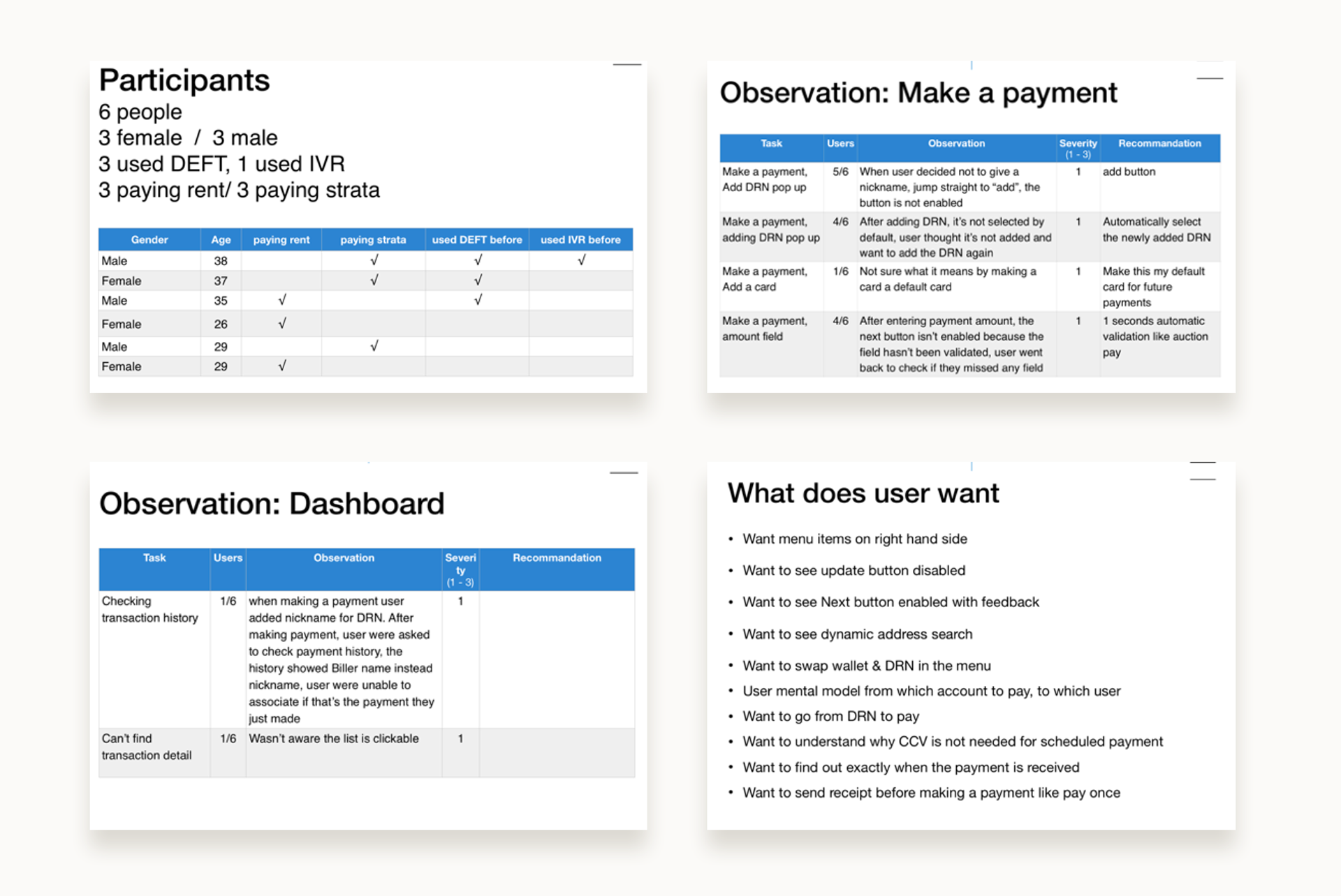
User testing
6 weeks before launch we started to do regular user testing in UAT environment to uncover potential usability issue.
2 participants each week, 1 renter, 1 homeowner
Key areas covered as below:
1. Migration/Registration flow
2. Login/password reset
3. Make payment flow
4. Check payment flow
Final design
Dashboard - Transaction History List